Back to blog
Baskerville Font
Feb 13, 2026
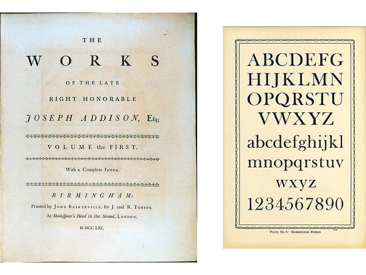
The typeface was designed by John Baskerville in 1757, Birmingham England.
Typography cut by punchcutter John Handy.
It is also called a "Transitional typeface" with a higher contrast between thick and thin
strokes with a vertical axis.
Isaac Moore created a later version of this font called “Fry’s baskervile” or “Baskerville
old Face”
History & technical context of its design
Baskerville made his money by selling lacquered goods and transformed
the quality of printing in england by using level presses, better
quality ink and glazing papers to have a smooth finish (it
was called woven paper)
He was also a calligraphy teacher that heavily inspired his font. His
typeface is very similar to the tombstones he used to carve in the
1730s. He spent seven years developing his printing project and
advertised in 1754 in books like Vergil and Paradise lost. In 1758, he
became the University Printer in Cambridge University Press.
He wasn’t successful in the local england print scene, initially. People
went as far as to say his font damaged their eyes after reading them. But abroad he had
started garnering fans (imitators even) like Benjamin Franklin (yes,
that benjamin franklin, he started out as a printer), Giambattista
Bodoni who wrote him letters praising his work.
Also to be noted, Bold weights were not present in his original
rendition that were only added in modern revivals
Uses
In the past Baskerville was used to print serious books such as previously
mentioned vergil, a paradise lost, versions of the bible.
Currently it is used for serious branding for institutions and other
serious things
My other thoughts & opinions about this font
I like Baskerville more than the older fonts like Garamond
The higher contrast in the strokes as compared to older fonts feels more established on the paper as compared to Garamond
the smaller circumference at the terminal (the round part of the beginning f) give it less of the inked by pen vibes.
Random facts about John Baskerville
He famously wore colourful clothes. His favourite colours were red, green & gold
He entered the printing & typesetting scene at the age of FIFTY
He became rich selling lacquered goods, the technique of which he copied from some guy called Taylor by following him around the city and buying up all the stuff, he was selling at places
did some rip off chinese lacquering technique called “japanning”
He was pissed off that he didn’t make as much money from printing
His peers didn’t like him allegedly because of his personality and atheism
After his death, between 1775 - 1963, his body remains were moved 4 times before being buried again in Warstone Lane Cemetery. He was an atheist and didn’t care about being buried in a christian cemetery
In 1996, Emigre fonts released a font in his wife’s name “Mrs Eaves” (her name was Sarah Eaves)